I'm learning how to paint on my iPad Pro by "tracing" stills from Tinker Tailor Soldier Spy and sharing the results here.
I had to start somewhere, and the first random still was from the movie's opening credits: a brief passerby shot of people hanging out in a very mid-century rec lounge:

(The weird reflection on the right side is my living-room window.)
I put this image into Procreate, put a new layer on top for painting, and just started in with the default brush. I hadn't even read anything about how to use Procreate yet, so at first I was just eyeballing the colours. Things got a little easier after I figured out I could tap-and-hold anywhere on the image to sample the colour.
Of course, painting with the same colour as the background you're copying makes it hard to see how much colour you're actually applying, and the first time I switched off the original I was surprised by how many huge gaps there were in the picture. Procreate's default brush has a lot of texture to it as well - which is great for making art look realistically "hand-made" but was perhaps too much texture for representing such an austerely modernist space. So I found the "smudge" tool and used it perhaps too much, giving everything a rather washed-out look.
I only used one layer for painting this, so foregrounds and backgrounds are kind of messed up, especially around the windows, and I didn't have the wherewithal to fill in the dark space behind "MARK STRONG".
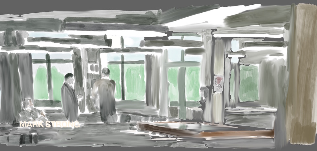
Copying an image really lets you appreciate all the details in the original. There's so much care in the set-dressing and design here: they have a pool table and what seems to be foosball. Not only is there a vintage wall-phone, but of course it has a security warning poster right next to it. The men might be discussing something important but everyone is facing away and the camera feels like an unsuccessful eavesdropper - a perfect image for this film, actually.
I love the colour palette of this still - all blue-grey and dark, but with just a touch of brown and red. Also, how awesome are those ceiling lights? They almost steal the whole show.